On the whole, my magazine Transmission conforms to all of the conventions we have came to associate with a wide range of magazines in the genre. This point is exemplified by the stylized, individual and noticable masthead. It was made it in contrasting colours, a feature seen in magazines such as Q and NME. The distinguished and prominent font style also gives the impression of it being a logo rather than just a masthead, I capitalised on this idea by again placing the logo on my "We give you the lowdown" section of my front cover. My front cover is heavily influenced by the widely popular NME magazine, a magazine that doesn't conform to the same clean stylised conventions as the likes of Q and Mojo, but favours a messy style, friendlier to the target audience of the 16-25 male demographic. As you can see, my front cover, shown in an earlier post shares many of conventions as the NME front cover shown below
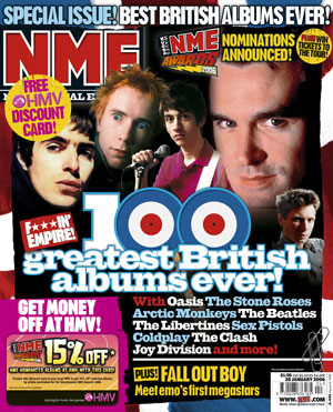
- Top left placement of masthead
- Text with advert to specific article placed above masthead which spreads across the width of the cover
- List of bands/artists featured in the issue
- Barcode placed in the bottom right
- Quotes from specific articles placed on the front cover, used to entice potential buyers into buying and subsequently reading the relevant article
- Puffs and text placed over main images
Double Page
As with my front cover, my double page spread conforms to the conventions apparent in many music magazines. It is one distinct image with a solid block of text, each on a different page. The image has been edited to give it a lighter feel than the original image and blurred either side of the main focus to make the artist appear sharper and draw the readers eye towards it. As is apparent in many newspapers and all magazines, my text is placed into thin columns, this makes it easier for the customer to read, but also allows more room for images, you can see an example here of where this has been used.
Contents Page
Throughout the production of my product, the colours red, yellow and black have been prominent, my contents page is no different. It conforms to the conventions that readers have came to expect from media magazines by having a large contents on the left hand side which uses buzzwords such as "EXCLUSIVE" and "EXPOSED." Furthermore, my page has titles like "Features" and "Regulars" - something far from uncommon in other magazines of a similar genre.
No comments:
Post a Comment