How do you attract your audience?
Rather than creating a product conforming to the conventions expected of a certain genre, simply because I liked that style of music - I chose to create a magazine that adheres to what fans want. My questionnaire I posted previously revealed a set of results that wanted an indie style magazine with interviews and reviews of concerts. You can see that I took notice of this through my 'Swoop to Conquer' feature in my double page spread. Furthermore, I found the Q forums an endless source of complaints about current magazines, which allowed me to capitalise on what many readers thought was missing in the current productions.
Tuesday 22 December 2009
Evaluation IV
What have you learned about technologies through constructing this product?
Initially, our brief suggested that the use of desktop publishing was necessary. So during the creation of my preliminary task, I became increasingly aware that Microsoft Publisher, which was used - did not have the same capabilities of programmes I have extensive knowledge of, such as Adobe Photoshop.
As I progressed onto my main task, I used Photoshop, so that I could capitalise on the skills I had learned through previous use of the program. It allows me to create effects, manipulate images and generally design in a way light years ahead of any desktop publishing program.
I fitted all of the components I created on Photoshop together using Adobe InDesign, another desktop publishing program used by professionals to create magazines
Throughout the production, I used blogger.com to track my progress. I learned a number of techniques, as initially I had no idea how to use the program. Implementing polls, post formatting and simply inserting images I had no idea to do, until I used blogger.
Evaluation III
Who is the target audience for your media product?
My research, conducted through an earlier posted questionnaire revealed that my target audience should be staunchly towards the 16-20 male demographic, of which represented 80% of those who completed my questionnaire. You can see that I adhered to the common ideas and conventions expected in productions that aim at the aforementioned demographic during my production, first of all by choosing to make an indie production, a music genre that has been revitalised amongst the younger generation in the last 5 years.
My research, conducted through an earlier posted questionnaire revealed that my target audience should be staunchly towards the 16-20 male demographic, of which represented 80% of those who completed my questionnaire. You can see that I adhered to the common ideas and conventions expected in productions that aim at the aforementioned demographic during my production, first of all by choosing to make an indie production, a music genre that has been revitalised amongst the younger generation in the last 5 years.
Evaluation II
What kind of institution would produce your magazine and why?
I would approach http://en.wikipedia.org/wiki/Bauer_Media_Group to be the producers of my magazine, due to its affluent history, including the production of "Q" and "Kerrang!" I believe that my magazine would fill a gap that is exposed in the lack of diversity between the aforementioned magazines. While "Kerrang!" focusses heavily on the metal genre of music, Q although originally an indie publication, now tends to focus on other mainstream artists heavily. As previously stated, my magazine conforms to the conventions similar to that of "NME" - and due to the nature of competition between Bauer and IPC media(the producers of NME) I believe that Bauer would produce my magazine in order to have a competitor with IPC in my specific genre of magazine. Furthermore, I believe that Bauer could capitalize on the success of their radio channels, Q and Kerrang! to advertise my magazine. Additionally, its recent purchase of EMAP, a major competitor, has shown that it has the capital to stay afloat in the current difficult economic climate, and subsequently would be able to fund the advertising and production of my magazine easily.
I would approach http://en.wikipedia.org/wiki/Bauer_Media_Group to be the producers of my magazine, due to its affluent history, including the production of "Q" and "Kerrang!" I believe that my magazine would fill a gap that is exposed in the lack of diversity between the aforementioned magazines. While "Kerrang!" focusses heavily on the metal genre of music, Q although originally an indie publication, now tends to focus on other mainstream artists heavily. As previously stated, my magazine conforms to the conventions similar to that of "NME" - and due to the nature of competition between Bauer and IPC media(the producers of NME) I believe that Bauer would produce my magazine in order to have a competitor with IPC in my specific genre of magazine. Furthermore, I believe that Bauer could capitalize on the success of their radio channels, Q and Kerrang! to advertise my magazine. Additionally, its recent purchase of EMAP, a major competitor, has shown that it has the capital to stay afloat in the current difficult economic climate, and subsequently would be able to fund the advertising and production of my magazine easily.
Wednesday 16 December 2009
Evaluation
In what ways does your media product use, develop or challenge forms and conventions of real media products?
 Such similarities include:
- Top left placement of masthead
- Text with advert to specific article placed above masthead which spreads across the width of the cover
- List of bands/artists featured in the issue
- Barcode placed in the bottom right
- Quotes from specific articles placed on the front cover, used to entice potential buyers into buying and subsequently reading the relevant article
- Puffs and text placed over main images
Double Page
As with my front cover, my double page spread conforms to the conventions apparent in many music magazines. It is one distinct image with a solid block of text, each on a different page. The image has been edited to give it a lighter feel than the original image and blurred either side of the main focus to make the artist appear sharper and draw the readers eye towards it. As is apparent in many newspapers and all magazines, my text is placed into thin columns, this makes it easier for the customer to read, but also allows more room for images, you can see an example here of where this has been used.
Contents Page
Throughout the production of my product, the colours red, yellow and black have been prominent, my contents page is no different. It conforms to the conventions that readers have came to expect from media magazines by having a large contents on the left hand side which uses buzzwords such as "EXCLUSIVE" and "EXPOSED." Furthermore, my page has titles like "Features" and "Regulars" - something far from uncommon in other magazines of a similar genre.
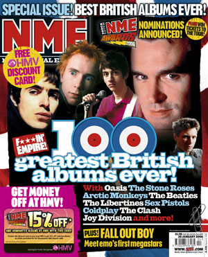
On the whole, my magazine Transmission conforms to all of the conventions we have came to associate with a wide range of magazines in the genre. This point is exemplified by the stylized, individual and noticable masthead. It was made it in contrasting colours, a feature seen in magazines such as Q and NME. The distinguished and prominent font style also gives the impression of it being a logo rather than just a masthead, I capitalised on this idea by again placing the logo on my "We give you the lowdown" section of my front cover. My front cover is heavily influenced by the widely popular NME magazine, a magazine that doesn't conform to the same clean stylised conventions as the likes of Q and Mojo, but favours a messy style, friendlier to the target audience of the 16-25 male demographic. As you can see, my front cover, shown in an earlier post shares many of conventions as the NME front cover shown below
- Top left placement of masthead
- Text with advert to specific article placed above masthead which spreads across the width of the cover
- List of bands/artists featured in the issue
- Barcode placed in the bottom right
- Quotes from specific articles placed on the front cover, used to entice potential buyers into buying and subsequently reading the relevant article
- Puffs and text placed over main images
Double Page
As with my front cover, my double page spread conforms to the conventions apparent in many music magazines. It is one distinct image with a solid block of text, each on a different page. The image has been edited to give it a lighter feel than the original image and blurred either side of the main focus to make the artist appear sharper and draw the readers eye towards it. As is apparent in many newspapers and all magazines, my text is placed into thin columns, this makes it easier for the customer to read, but also allows more room for images, you can see an example here of where this has been used.
Contents Page
Throughout the production of my product, the colours red, yellow and black have been prominent, my contents page is no different. It conforms to the conventions that readers have came to expect from media magazines by having a large contents on the left hand side which uses buzzwords such as "EXCLUSIVE" and "EXPOSED." Furthermore, my page has titles like "Features" and "Regulars" - something far from uncommon in other magazines of a similar genre.

Tuesday 15 December 2009


Wednesday 11 November 2009

This double page spread is taken from the UK based magazine Q, a magazine that focuses on each genre of music, and for the most part, on mainstream bands.
The main image is of the artist Shakira working in her studio, however scattered across the page, this breaks up large blocks of text, in turn making it far easier on the eye, and easier to read. There are stark contrasts between this double page spread and the Doves article used in MOJO, first of all, the glamorous appearance of the artist at hand is exemplified in stylishly created photos, a technique most certainly NOT used in the MOJO article. One would recognize the mainstream audience that reads Q as the main contributory factor for this, as a mainstream audience is far more likely to be used to airbrushed artists than the rugged, pure style of artist portrayed in the Doves article in MOJO.
The header of the right hand page states "Access All Areas," this is something I expect to see in all magazines, as it is a very common convention. It connotates exclusives, gossip or anything that if a reader chooses not to read the article at hand, they will never find out.
The article generally, is an overview of her career, and future plans, as shown where she talks about her plans to work with other artists in the future, however the format then changes into an interview style later in the text, and this is exemplified by the 'puff' shown with a quote inside. This style encapsulates the reader as it appeals to them on a personal level with the celebrity/artist, in a style which they would not witness in any other style of text.
Friday 6 November 2009
 This is the contents page to the magazine Kerrang! The magazine focuses on the Metal genre of music. I chose this to emphasize my willingness to stray out of my comfort zone when analysing media pieces, as well as the stark contrast to the magazines I have previously deconstructed; Mojo and Rolling Stone.
Clearly, the conventions we have came to expect from music magazines are adhered too strictly in this piece, as we can see the page numbers accompanying the band/album/concert name that is relevant to the piece. In addition to this, the editors notes are clearly prevalent, which only adds to the idea that Kerrang! magazine aim to follow the aforementioned conventions.
Further dissection of the image has drawn me to conclude that the magazine aims to produce a clear sharp piece, I can justify this opinion by looking at the main title and also contents separators, both have bold sharp yellow text placed on a black background. The black background contrasts so much with the yellow that it was the first thing I noticed upon viewing the page. It also leads me to believe that these colours are the housestyle of the magazine, as the pictures in the centre have also got the page numbers noted, in the colours mentioned.
In additon to this, I believe the magazine fits suitably into the genre it portrays very well, the style of music is edgy rather than inoffensive and it is clear from the pictures chosen by the editor that the magazine too fits in with those conventions, as shown by the pictures with artists in action and in the case of the Lamb of God image, that the artist is screaming down the microphone.
Monday 2 November 2009
 This image, is a double page spread from the rock/alternative music magazine Mojo.
The headline which reads "Two Nights in Bird Land" has both historical context and also fantastic contrast, the black on the yellow background stands out to the point that the reader is almost instantly drawn to the headline, while readers aware of musical history will be notice that the colours connote the legendary Factory Records. A company that started The Doves' career's when they were dance act Sub Sub.
The main image shows the band performing with numerous lights over the guitarist, while this shows the band's current activity, the mixture of the colours in the lighting also promotes the idea that the band are still in touch with their Sub Sub roots, a band which bled the late 80's 'MADchester' music scene ideas.
The top right of the spread shows extreme close up pictures of the band members in polaroid style. This shows that the band are not manufactured, as the pictures have not been airbrushed and subsequently show all of the 'flaws' such as wrinkles that the shallow music industry care so much about. Additionally, it also shows that the band have an attitude which suggests that they do not care how they are percieved, and care more about the success and sound of their music, and that they are satisfied with their sound rather than their image.
Furthermore, and only adding to their 'normal people' image, in the second block of text, the band are talking to the reporter, frequently using colloquial language, the use of 'slang' only further adds to the aforementioned image.
Separating the previously mentioned polaroid images, is a puff displaying a quotation that reads "If I don't create music, I'm nothing," the text is displayed in yellow text on a red background, again a massive contrast that clearly shows that the readers' eye is supposed to be drawn towards it.
 The picture to the left, is the cover of the April 16th edition of Rolling Stone. The main image of the cover is of current rap sensation Lil' Wayne. The picture shows the artist in what can be percieved as deep thought. This, in conjunction with the subtext of "Rap Genius Changes His Game" suggests to the audience that the artist is thinking of how to portray himself as a 'rock' performer, and also thinking of the more 'complicated' lyrics of the Rock genre rather than the stereotypically ignorant 'Guns, Babes and Bling' lyrics associated with rap.
On the contrary however, the picture, with the artists eyes closed looking down, as if he was asleep also adds to the arrogant front that Lil Wayne has created for himself, the idea that despite his planned astronomical change of style, it is boring to him, and that his talent all comes naturally and subsequently isn't as much of a bombshell as it would be to others.
Further dissection of the image shows the artist with his top off, revealing numerous tattoo's. One would presume that this was too attract those who are aware of the artists under-privileged background and subsequent meteoric rise, as it shows that although he plans an astronomical change in style and attitude, he still represents where he is from, and his roots in the rap industry. This is done by showing off the tattoo's that go some way to glorifying the aforementioned rap 'staples' of 'Guns, babes and bling,' such as the dice on his left shoulder, which connotates the idea of making money. Although the tear drops he has tattooed under each eye, are the most tell tale sign of his dedication to the gangster image, as they are a symbol used in American gang culture to symbolize how many murders a person has committed.
The headline and the lines that separates the puffs are in a light shade of yellow, this connotates to the audience that with the change of music the artist has actually had a change in attitude also, as yellow connotes mellowness and calmness, a severe contrast to the lifestyle that his 'former' gangster lifestyle portrays. On the contrary however, the colour could also be percieved as a gold rather than yellow which connotes money and also power, something that again goes back to the previously mentioned 'Guns babes and bling' lifestyle that some artists wish to adhere too.
One of the puffs, situated in the top right corner of the image, which reads 'The Bush Crimes, inside the interior department' is in white text, and placed on a black background, the contrasting colours make it easy for the audience to read, and ultimately makes the text standout, which suggests that the topic is important, and something that the publishers/editors feel strongly about.
Wednesday 30 September 2009
Questionnaire Published!
The following is a questionnaire I produced in order to gain an insight in what encourages a reader to purchase a specific magazine, it was also created with the intention of finding a gap in the market that a prospective music magazine could capitalize on.
You can find the questionnaire HERE.
You can find the questionnaire HERE.
Tuesday 29 September 2009
Masthead choices - Please Vote
The following are some preliminary masthead mock-ups I have created, I would appreciate if you could vote for your favourite, please note however that they may not actually be on black backgrounds when the magazine is created, so don't take the contrast of colours and what you denote from the colour black into account. On the contrary, I would like you to vote for the colourscheme that you deem most appropriate for a magazine that follows 'classic' indie music.


Subscribe to:
Posts (Atom)